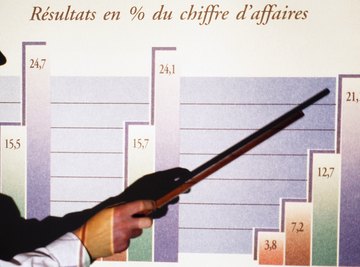
Using a histogram allows you to identify how frequently a range of data occurs within defined parameters. Although similar in appearance to a bar graph, the absence of a space between the columns of data distinguishes a histogram from a bar graph -- where data columns include a space between each. To read and accurately analyze the information in a histogram you need to start by adding information correctly. Correct labeling is an essential first step in the process.
Look at the table from which you will be extracting data to get ideas for appropriate histogram labels. As an example, consider a table that shows income levels by age group or hours a group of students spends watching television.
Look at a blank graph and identify its x and y-axis. The x-axis always runs horizontal -- along the bottom of the histogram and the y-axis runs vertical -- or lengthwise.
Label the y-axis to identify what you are measuring. A label such as per capita income is appropriate for a histogram displaying income levels by age group. Number of students is a good label for a histogram displaying hours a group of students spends watching television.
Label the x-axis using a term called a quantitative variable identifier that identifies variable you are measuring. A label such as age is appropriate for a histogram displaying income levels by age group. Hours is a good label for a histogram displaying hours a group of students spends watching television.
Add details along the x and y-axis to indicate quantity and to break the data into equal ranges. If you are displaying per capita income up to $40,000, you can include an income range such as $10,000, $20,000, $30,000 and $40,000 along the y-axis and age groups such as 25 to 34, 35 to 44, 45 to 64 and 65 to 74 across the x-axis. If you are displaying hours a group of 20 students spends watching television, you can label the students in groups such as two to four along the y-axis and a range of hours, such as 1 to 3, 4 to 6, 7 to 9 and 9+ hours along the x-axis.
References
About the Author
Based in Green Bay, Wisc., Jackie Lohrey has been writing professionally since 2009. In addition to writing web content and training manuals for small business clients and nonprofit organizations, including ERA Realtors and the Bay Area Humane Society, Lohrey also works as a finance data analyst for a global business outsourcing company.
Photo Credits
Goodshoot/Goodshoot/Getty Images
